Create Glowing Pulse Search Bar Using HTML and Pure CSS (Source code)

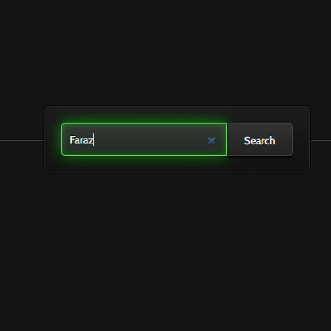
 Discover the art of crafting an engaging, visually striking pulsating search bar using HTML and CSS. This comprehensive guide is tailor-made for web designers seeking a step-by-step tutorial.


Engage with us on Telegram! Search boxes, a quintessential element in web design, grace virtually every website. Positioned prominently, they serve as gateways to a site's content, facilitating swift navigation.


Unveil the magic by fashioning a simple, centrally aligned form with a captivating pulsating glow effect upon input focus.


Join my Telegram Channel for Project Download: Click Here


Prerequisites:


Before delving into this tutorial, ensure a fundamental grasp of HTML and CSS. Equip yourself with a code editor like Visual Studio Code or Sublime Text for seamless code creation and storage.


Source Code


Step 1 (HTML Code):


Initiate the journey by constructing a foundational HTML file. Below is a basic markup featuring a search input and button, awaiting your artistic styling. Copy and paste these codes into your HTML document, saving it with a .html extension for optimal web browser viewing.


This establishes the groundwork for our HTML-based search bar, setting the stage for the subsequent CSS embellishment.


<!DOCTYPE html>
<html lang="en">
<head>
    <meta charset="UTF-8">
    <meta http-equiv="X-UA-Compatible" content="IE=edge">
    <meta name="viewport" content="width=device-width, initial-scale=1.0">
    <title>Document</title>
    <link rel="stylesheet" type="text/css" href="styles.css">
</head>
<body>
    <section class="webdesigntuts-workshop">
        <form action="" method="">
            <input type="search" placeholder="What are you looking for?">
            <button>Search</button>
        </form>
    </section>
</body>
</html>

Step 2 (CSS Code):


Having laid the HTML groundwork, the next stride involves adorning the search input and button with CSS finesse. CSS empowers control over visual elements, encompassing layout, color, and typography.


Create a styles.css file, embedding fundamental CSS rules to enhance the search bar's aesthetics. With added padding and margin properties, ensure a polished appearance. Save this CSS file with the .css extension.


@import url(https://fonts.googleapis.com/css?family=Cabin:400);

.webdesigntuts-workshop {
	background: #151515;
	height: 100%;
	position: absolute;
	text-align: center;
	width: 100%;
}

.webdesigntuts-workshop:before,
.webdesigntuts-workshop:after {
	content: '';
	display: block;
	height: 1px;
	left: 50%;
	margin: 0 0 0 -400px;
	position: absolute;
	width: 800px;
}

.webdesigntuts-workshop:before {
	background: #444;
	background: linear-gradient(left, #151515, #444, #151515);
	top: 192px;
}

.webdesigntuts-workshop:after {
	background: #000;
	background: linear-gradient(left, #151515, #000, #151515);
	top: 191px;
}

.webdesigntuts-workshop form {
	background: #111;
	background: linear-gradient(#1b1b1b, #111);
	border: 1px solid #000;
	border-radius: 5px;
	box-shadow: inset 0 0 0 1px #272727;
	display: inline-block;
	font-size: 0px;
	margin: 150px auto 0;
	padding: 20px;
	position: relative;
	z-index: 1;
}

.webdesigntuts-workshop input {
	background: #222;
	background: linear-gradient(#333, #222);
	border: 1px solid #444;
	border-radius: 5px 0 0 5px;
	box-shadow: 0 2px 0 #000;
	color: #888;
	display: block;
	float: left;
	font-family: 'Cabin', helvetica, arial, sans-serif;
	font-size: 13px;
	font-weight: 400;
	height: 40px;
	margin: 0;
	padding: 0 10px;
	text-shadow: 0 -1px 0 #000;
	width: 200px;
}

.ie .webdesigntuts-workshop input {
	line-height: 40px;
}

.webdesigntuts-workshop input::-webkit-input-placeholder {
   color: #888;
}

.webdesigntuts-workshop input:-moz-placeholder {
   color: #888;
}

.webdesigntuts-workshop input:focus {
	animation: glow 800ms ease-out infinite alternate;
	background: #222922;
	background: linear-gradient(#333933, #222922);
	border-color: #393;
	box-shadow: 0 0 5px rgba(0,255,0,.2), inset 0 0 5px rgba(0,255,0,.1), 0 2px 0 #000;
	color: #efe;
	outline: none;
}

.webdesigntuts-workshop input:focus::-webkit-input-placeholder {
	color: #efe;
}

.webdesigntuts-workshop input:focus:-moz-placeholder {
	color: #efe;
}

.webdesigntuts-workshop button {
	background: #222;
	background: linear-gradient(#333, #222);
	box-sizing: border-box;
	border: 1px solid #444;
	border-left-color: #000;
	border-radius: 0 5px 5px 0;
	box-shadow: 0 2px 0 #000;
	color: #fff;
	display: block;
	float: left;
	font-family: 'Cabin', helvetica, arial, sans-serif;
	font-size: 13px;
	font-weight: 400;
	height: 40px;
	line-height: 40px;
	margin: 0;
	padding: 0;
	position: relative;
	text-shadow: 0 -1px 0 #000;
	width: 80px;
}

.webdesigntuts-workshop button:hover,
.webdesigntuts-workshop button:focus {
	background: #292929;
	background: linear-gradient(#393939, #292929);
	color: #5f5;
	outline: none;
}

.webdesigntuts-workshop button:active {
	background: #292929;
	background: linear-gradient(#393939, #292929);
	box-shadow: 0 1px 0 #000, inset 1px 0 1px #222;
	top: 1px;
}

@keyframes glow {
    0% {
		border-color: #393;
		box-shadow: 0 0 5px rgba(0,255,0,.2), inset 0 0 5px rgba(0,255,0,.1), 0 2px 0 #000;
    }
    100% {
		border-color: #6f6;
		box-shadow: 0 0 20px rgba(0,255,0,.6), inset 0 0 10px rgba(0,255,0,.4), 0 2px 0 #000;
    }
}

In essence, fashioning a pulsating search bar amplifies user interaction, elevating your website's appeal. This tutorial guides you through the process, enabling the creation of an aesthetically pleasing and dynamic search bar that distinguishes your website.


Experiment freely, infusing personal touches into the design. It's a wrap!


I trust you relished this tutorial. Armed with these insights, forge your extraordinary web page.


Did you find it enjoyable? Share your thoughts in the comments below 🔥, and consider supporting me with a coffee.


Don't miss out! Subscribe to our email newsletter for more invaluable content delivered straight to your inbox!


Thanks!

coder verse 😊

Post a Comment

Previous Post Next Post