
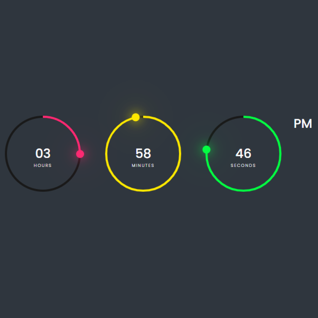
A digital clock signifies the presentation of time in numerical format. JavaScript retrieves real-time data from your device and exhibits it on the webpage. This article delves into the process of how JavaScript acquires and showcases the time using fundamental methods. Essentially, it's a real-time digital clock, allowing you to observe the time in hours, minutes, and seconds. The clock operates seamlessly, eliminating the need to refresh the website for updated time.
Now, let's embark on the journey of creating an impressive responsive navbar with a hamburger menu using HTML, CSS, and JavaScript, step by step.
To access the project download, join my Telegram Channel: [Click Here]
Prerequisites:
Before diving into this tutorial, ensure you have a foundational understanding of HTML, CSS, and JavaScript. Additionally, you'll require a code editor like Visual Studio Code or Sublime Text to write and save your code.
Source Code
Step 1 (HTML Code):
Begin by creating a basic HTML file, incorporating the essential structure for our digital clock. Paste the provided code into your file, ensuring it's saved with a .html extension for proper viewing in a web browser.
<!DOCTYPE html>
<html lang="en">
<head>
    <meta charset="UTF-8">
    <meta http-equiv="X-UA-Compatible" content="IE=edge">
    <meta name="viewport" content="width=device-width, initial-scale=1.0">
    <title>Document</title>
    <link rel="stylesheet" href="styles.css">
    <script type="text/javascript" src="script.js"></script>
</head>
<body>
  <div class="container">
    <div id="time">
      <div class="circle" style="--color: #ff2972">
        <div class="dots h_dot"></div>
        <svg>
          <circle cx="70" cy="70" r="70"></circle>
          <circle cx="70" cy="70" r="70" id="hh"></circle>
        </svg>
        <div id="hours">00</div>
      </div>
      <div class="circle" style="--color: #fee800">
        <div class="dots m_dot"></div>
        <svg>
          <circle cx="70" cy="70" r="70"></circle>
          <circle cx="70" cy="70" r="70" id="mm"></circle>
        </svg>
        <div id="minutes">00</div>
      </div>
      <div class="circle" style="--color: #04fc43">
        <div class="dots s_dot"></div>
        <svg>
          <circle cx="70" cy="70" r="70"></circle>
          <circle cx="70" cy="70" r="70" id="ss"></circle>
        </svg>
        <div id="seconds">00</div>
      </div>
      <div class="ap">
        <div id="ampm">AM</div>
      </div>
    </div>
  </div>
</body>
</html>Step 2 (CSS Code):
Once the HTML structure is established, the next phase involves styling the digital clock using CSS. Create a CSS file named styles.css and apply the provided codes. This CSS file (.css extension) enhances the visual presentation of our digital clock.
@import url('https://fonts.googleapis.com/css2?family=Poppins:wght@100;300;400;500;600;700;800;900&display=swap');

* {
  margin: 0;
  padding: 0;
  box-sizing: border-box;
  font-family: 'Poppins', sans-serif;
}

.container {
  width: 100%;
  min-height: 100vh;
  display: flex;
  justify-content: center;
  align-items: center;
  background: #2f363e;
}

#time {
  display: flex;
  gap: 40px;
  color: #fff;
}

#time .circle {
  position: relative;
  width: 150px;
  height: 150px;
  display: flex;
  justify-content: center;
  align-items: center;
}

#time .circle svg {
  position: relative;
  width: 150px;
  height: 150px;
  transform: rotate(270deg);
}

#time .circle svg circle {
  width: 100%;
  height: 100%;
  fill: transparent;
  stroke: #191919;
  stroke-width: 4px;
  transform: translate(5px, 5px);
}

#time .circle svg circle:nth-child(2) {
  stroke: var(--color);
  stroke-dasharray: 440;
}

#time div {
  position: absolute;
  text-align: center;
  font-size: 1.5rem;
  font-weight: 500;
}

#time div span {
  position: absolute;
  transform: translate(-50%, 0px);
  font-size: 0.5rem;
  font-weight: 300;
  letter-spacing: 0.1rem;
  text-transform: uppercase;
}

#time .ap {
  position: relative;
  font-size: 1rem;
  transform: translate(-20px);
}

.dots {
  position: absolute;
  width: 100%;
  height: 100%;
  display: flex;
  justify-content: center;
  z-index: 10;
}

.dots::before {
  content: '';
  position: absolute;
  top: -3px;
  width: 15px;
  height: 15px;
  background: var(--color);
  border-radius: 50%;
  box-shadow: 0 0 20px var(--color), 0 0 60px var(--color  );
}Step 3 (JavaScript Code):
To make the clock operational, we need to integrate JavaScript. Create a JavaScript file named script.js, paste the given codes, and ensure proper linking to your HTML document. Remember to save the file with a .js extension.
setInterval(() => {
  // get time indicator elements
  let hours = document.getElementById('hours');
  let minutes = document.getElementById('minutes');
  let secondes = document.getElementById('seconds');
  let ampm = document.getElementById('ampm');

  // digits time indicator
  let hh = document.getElementById('hh');
  let mm = document.getElementById('mm');
  let ss = document.getElementById('ss');


  // dot time indicator
  let dotH = document.querySelector('.h_dot');
  let dotM = document.querySelector('.m_dot');
  let dotS = document.querySelector('.s_dot');

  // get current time
  let h = new Date().getHours();
  let m = new Date().getMinutes();
  let s = new Date().getSeconds();
  let ap = h >= 12 ? 'PM' : 'AM';

  // convert to 12 hour format
  if (h > 12) {
    h = h - 12;
  }

  // add 0 before single digit
  h = h < 10 ? '0' + h : h;
  m = m < 10 ? '0' + m : m;
  s = s < 10 ? '0' + s : s;

  // set time and label
  hours.innerHTML = h + 'Hours';
  minutes.innerHTML = m + 'Minutes';
  secondes.innerHTML = s + 'Seconds';
  ampm.innerHTML = ap;

  // set time circular indicator
  hh.style.strokeDashoffset = 440 - (440 * h) / 12;
  mm.style.strokeDashoffset = 440 - (440 * m) / 60;
  ss.style.strokeDashoffset = 440 - (440 * s) / 60;

  // set dot time position indicator
  dotH.style.transform = `rotate(${h * 30}deg)`;
  dotM.style.transform = `rotate(${m * 6}deg)`;
  dotS.style.transform = `rotate(${s * 6}deg)`;
}, 1000)
;In conclusion, we've explored the process of constructing a digital clock from scratch using HTML, CSS, and JavaScript. This project serves as an excellent introduction to web development, reinforcing concepts in HTML, CSS, and JavaScript. To further your web development journey, consider building more projects and exploring additional resources like online tutorials and coding bootcamps.
That wraps up our tutorial! I hope you found it enjoyable and insightful. Now armed with these examples, you can create your own remarkable webpage.
Liked it? Share your thoughts in the comments below 🔥
Thanks!
CODER VERSE 😊